Deborah J. DiCerbo | Art/Creative Director, Graphic Designer

Your logo is the face of your business and the first impression to your customers, and should reflect your company’s vibe and brand vision. A professional, well designed and refined logo is clean, balanced, easy to read at both one inch and five inches, and does not rely on color to make it work…rather, adding color is the final finishing touch.
Logo redesign for non-profit organization that offers support for siblings of children with serious illnesses, disabilities or other special needs, in the form of various activities, events, counseling and more. I wanted to convey the image of children connecting and caring for each other, while incorporating the graphic of a school bus stop sign.
This is a nationwide program that encourages families to eat more meals together and outlines the many benefits of doing so. Price Chopper Supermarkets partnered with Cornell Cooperative Extension and Eat Smart NY in producing a flyer (which I also designed) and hosting in-store events to educate customers about the program.
This logo was designed for a freelance photographer. I creatively used the initials to create one side of the camera and the lens, accentuating the lens to play off of the name of her business. Using a very simple graphic representation of the camera and making all lines in the image the same thickness keeps it clean and simple.
Golub Corporation is the parent company of Price Chopper Supermarkets. This logo was designed to complement the Price Chopper logo by using the same colors and star pattern from the “coin.”
The goal was to create a more modern, but still “corporate” image. My pick was the top left…after making requested revisions to this one, we ended up with the final logo.
This logo was designed for a company that distributed music CDs, displays, signing and more. The exclamation point was used to “punctuate” the image of “now and happening” that the client wanted to portray.
Logo for real estate investment company, using the initials of the owners and simple identifiable imagery to represent a house, or “real estate” concept. Slightly separating the vertical stroke of the upper case D and adding a cap clearly defines it as a chimney, while the eye connects the shapes to still obviously read as a D. The window icons were repeated below as an interesting graphic element to tie it together.
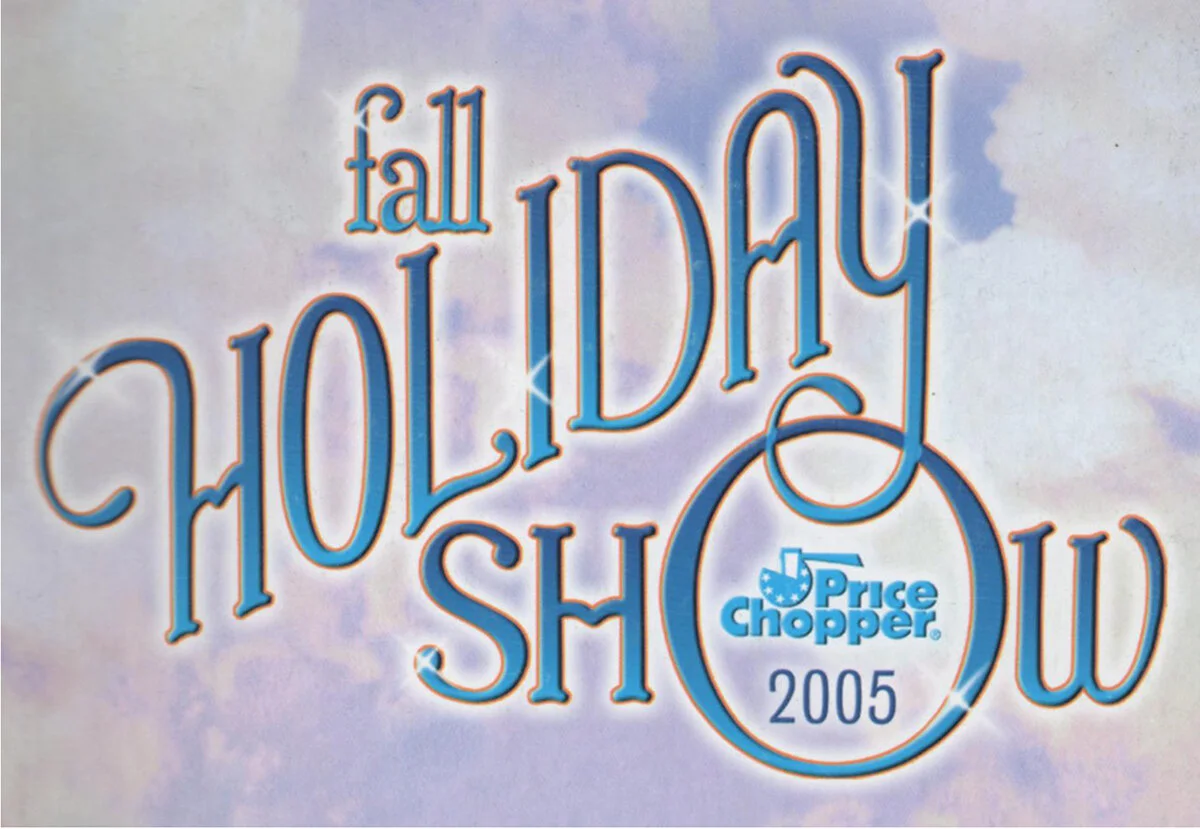
For our annual merchandising trade show, this year’s theme played off the famous line from the Wizard of Oz, “there’s no place like home,” and everything was Wizard of Oz themed. Being a HUGE fan, this was right up my alley! The show logo was designed to mimic the classic Wizard of Oz movie logo. Since this was custom lettering, there was no font existing to match it, so I created my own custom typography. I used the original logo as a template and traced over any existing letters I could use, and manually drew the others to match in Illustrator, applying the same colors. Then brought it into Photoshop and worked my own wizardry to match the same effects!
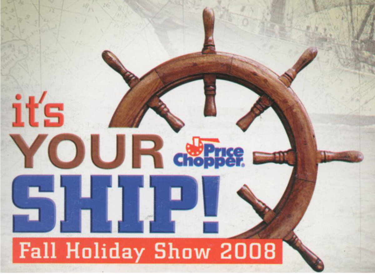
This year’s merchandising trade show theme was based on the book by former U.S. Navy commander Michael Abrashoff, in which he explains the management principles that he used to command one of the Navy's most modern warships and how they can be used in a business environment. A ship’s wheel was the obvious choice for a graphic, since we were portraying the idea of “steering a ship” (I was going for a classic nautical feel, so I used the old-fashioned wheel). Along with picking up the brown color of the wheel, I used the Price Chopper red and blue brand colors.
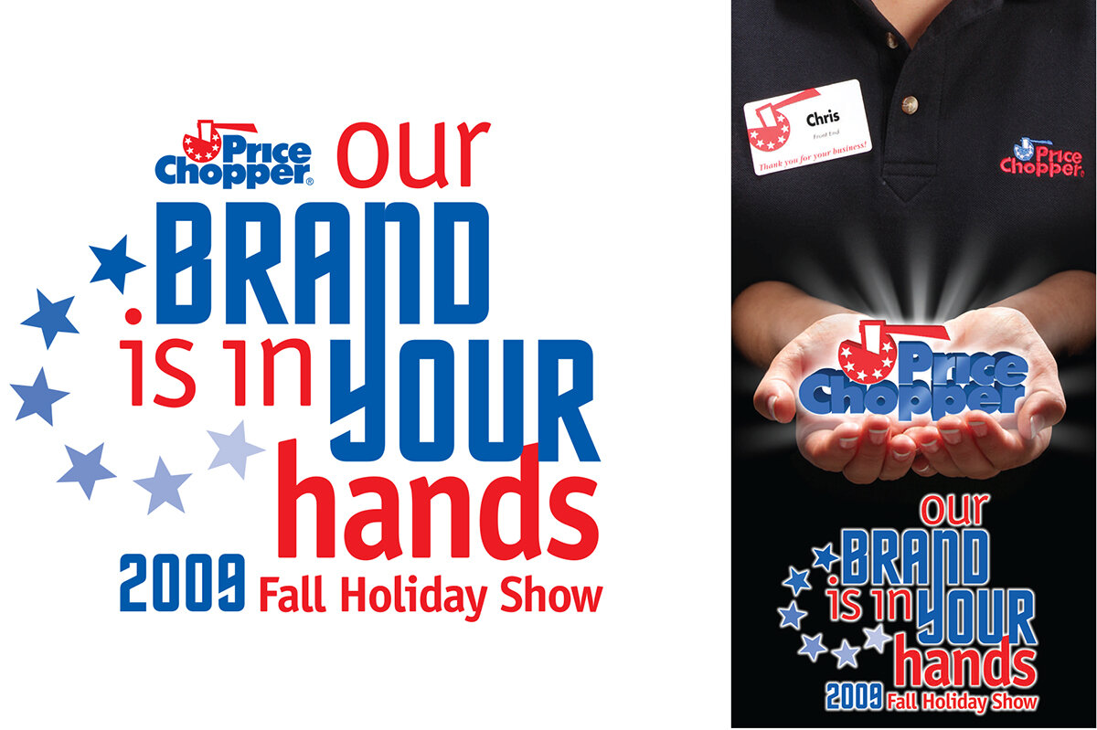
This year’s theme centered around the company beginning a new branding initiative, and the goal was to get teammate buy-in, and really drive home the message that EVERYONE and EVERYTHING mattered in creating our brand image. The logo was always to be used in conjunction with the main feature image, which was a photo of a store teammate actually holding a sort of “ethereal” Price Chopper logo (which believe me, required a lot of Photoshop magic!)…so that’s why there’s no representation of “hands” in the logo - that would have been redundant. I incorporated the circular star pattern from the Price Chopper logo and used the red and blue brand colors for cohesion and consistency.
Arts in Education was a University at Albany partnership of educators and artists designed to bring arts-centered learning to young people in schools. I used the symbol of a pillar to represent education, along with various symbols representing different aspects of “the arts.” This was a design competition in which this design was chosen for first place, and two of my other designs were chosen as second and third places as well. This logo also won a Silver award in the “Pro-Bono” category at the Albany Ad Club Nori Awards (local Advertising Industry) competition.
This is my personal logo, using my initials. I wanted something clean, simple and contemporary, yet timeless. Just one font was used in different weights, and I played with the positive and negative spaces to create an interesting and balanced design.
I wanted to create something fun, colorful and playful for this local event, which features restaurants from around the Capital Region where event-goers vote for the best Mac-n-Cheese dish, and benefits the Regional Food Bank of Northeastern NY.
Music Haven Concert Series is a free summer concert series that brings a diverse variety of musical acts from all over the world to a local park. I used a graphic image of the stage itself, with trees to represent the park setting and the globe and music imagery to represent global music.
To commemorate the 70th anniversary of the company. The star element and colors tie in with the Price Chopper logo.
An annual Thanksgiving Day marathon to benefit the Heart Center at a local hospital. The graphic image of a heart serves as the “C” in Cardiac Classic to represent what the event is about.
A local non-profit organization whose mission is to improve social relations and stimulate community empowerment. I used their logo within the “zero” of the 60, along with the fonts and “SS” from their logo to create a cohesive image.
I created a graphic representation of the Albany Capital building and used a “stately” typeface to give it that feel. This logo was featured on a special commemorative edition Pepsi can.
This was used on a Price Chopper store window poster to promote an in-store fundraising program to help bring National Guard Soldiers home for the holidays. The use of the “stamp” font symbolizes the military, while the wreath and house icon symbolize “home for the holidays.”
This was for a local non-profit organization made up of women volunteers who raise funds to support organizations which support women and girls. I used the “S” from their logo to create the flower, and a delicate modern script to give it a feminine feel. Logo was used on tickets, posters and programs.
Designed for a local competitive high school marching band, this logo incorporates their “Warrior” logo within it and uses modern fonts for an updated image. Logo was used on jackets, t-shirts, sweatshirts, hats, magnets, and more…
“Sounds in Motion” is the name of their field band home competition - this graphic was created first, for use on the show program book. “Colors in Motion” is the name of their indoor winter color guard home competition - this was created to have a consistent look with the band logo, replacing the music staff with the rainbow, and incorporating a flag image into the type.
A well designed poster must have engaging, captivating imagery to draw the reader in, while using proper information hierarchy to present the details clearly and effectively…with just enough to create interest, but not become cluttered.
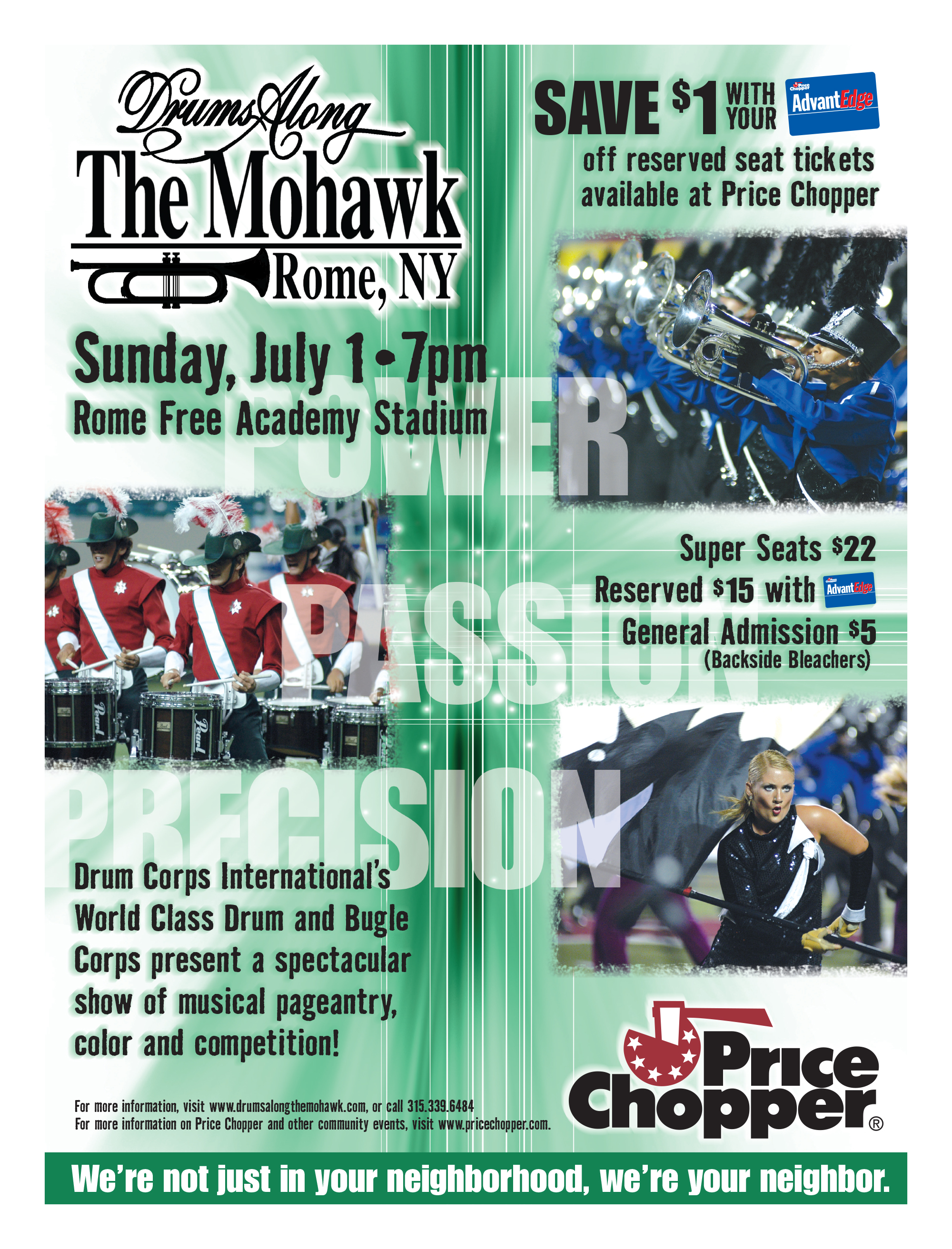
We needed to capture the essence of drum corps in an exciting way to not only attract our target audience, but also those who might not otherwise have an interest in it. Incorporating their tagline of “power, passion, precision” and dramatic performance photos from different corps was a sure way to draw people in and create interest in this event.
This poster promoted our giveaway offer at a Scranton/Wilkes-Barre Yankees baseball game (The triple-A affiliate of the New York Yankees). In addition to the logo, the classic pinstripes quickly convey “Yankees” and the stylized player action shot leads the eye into the event details.
The goal of this piece was to create awareness about our acceptance, inclusion and employment of those with developmental disabilities. I showcased two such store teammates, along with star imagery, to convey the idea of empowerment and that they can be “star” employees.
Although this piece was a college project, it will always be a part of my portfolio, since it was my first award winner! Saratoga Performing Arts Center (SPAC) had formerly commissioned world famous graphic designer Milton Glaser to design their annual posters. This year, they decided to make it a design competition between the art and design schools throughout New York state, and my design was chosen as the winner. To me, the three things SPAC was known for were the Orchestra, Ballet and Concerts. I chose to represent those categories using simple silhouettes and flat shapes of color, while the music staffs and notes tie them all together. Original medium was cut paper on black illustration board, with the smaller detail done in black ink.
Appropriate imagery and fonts convey the small town country feel of this festival. Hand-drawn, layered with water color-type illustrations of violets create an interesting background pattern, while a monochromatic color scheme picking up various shades of purple from the images exudes the “violet” theme.
Use of a beautiful photograph of fresh tomatoes and a tomato icon incorporated into the headline leaves no doubt as to what this festival is about!
This was for a local contest, in which students submit essays and artwork about influential and important figures and events in black history. The primary graphic represents “african-american,” while the stylized font conveys an “ethnic” feel. The photos feature some of the essay and artwork subjects.
For the primary savings message, I wanted to mimic the shape and feel of the Lake Monsters logo, so I created the same effects on the “SAVE $2” type for a custom typography look. This, along with the player action shot photo with special effects, creates an engaging poster.
Presenting the vehicles in a fun, yet purposeful way and using a stylized type treatment for the headline attracts children to this exciting family event.
Using images of a roller coaster and water ride immediately grabs your attention and speaks to what this park is about. The colors from the water ride photo are carried throughout to create an overall color theme, and the messages are presented in an exciting way.
The playful cartoon images, headline treatment and bright colors were meant to get the attention of children, and the information, which looks like a child’s handwriting, is clearly presented so that they can understand it.
This was designed to encourage people to get their event registration forms at Price Chopper. Coach Calhoun was a highly recognizable figure, so I used him prominently, along with the event logo, to grab attention, and mimicked the shape of the event logo to present the information in a more interesting, unconventional way.
This poster uses bright colors and playful typefaces to get the attention of children, and photos of a child actually making a bouquet appeals to them and makes them think, “hey, I want to do that!”
A successfully executed ad campaign must have a clear purpose - WHAT are we trying to say, WHO are we saying it to, and WHY? It is essential that the headline, copy and imagery make an emotional connection and compel the reader to take action in some way. Is it to purchase a product? Attend an event? Make a donation? The message must be apparent, simple and to the point.
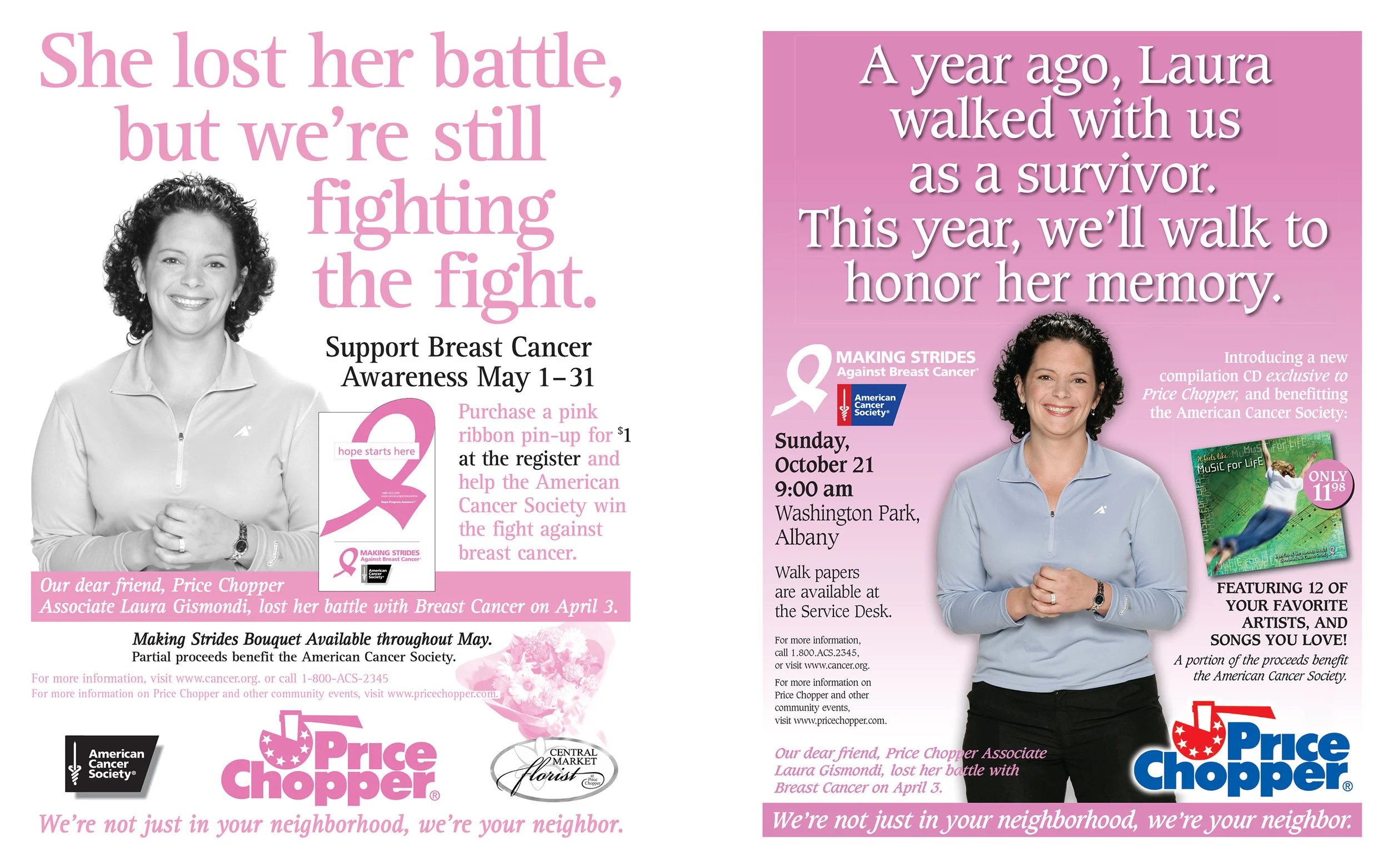
In the past, we had featured teammates who were breast cancer survivors on our promotional materials for Making Strides, with a positive message of survival. In this case, we had sadly lost one of those beloved teammates, so I thought a change of direction, highlighting instead that she had lost her battle, would be more emotional and compelling, and would urge people to donate in our stores, or participate in the walk. This resulted in a 47% increase in pin-up donations, and won a National Grocers Association award for “Best Public Service Campaign.” Assets included window posters, register signs and newspaper ads.
We had featured this teammate on our Making Strides promotional materials in prior years as a survivor. Her cancer came back a second time, and she was in remission again. We wanted to focus on that message to compel people to act, to help in furthering research for even more life-saving treatments. (Sadly, she lost her courageous battle with breast cancer a few years later.) Assets included window posters, register signs and newspaper ads.
Using elements from MDA’s national campaign, this window poster encouraged our customers to donate at the register to help kids with Muscular Dystrophy. Other assets included Google web ads, Facebook ads, register signs and electronic register monitors.
This was a campaign to newly brand our food service offering and convince customers that instead of cooking, we had everything they needed and were their answer to “what’s for dinner?” Utilizing photographs of professional chefs and mouthwatering food, we improved perceptions about the quality and variety of our offering. This won a National Grocers Association Award for “Best Advertising Campaign” and was also nominated for “Best of Show.” Ensuring brand consistency among all elements, assets included shopping bags, hot and cold beverage cups, pizza boxes, side dish containers, napkins, brochures, extensive store signing and print ads. This required coordination with multiple print and packaging vendors, coordination of in-store photography with photographer, food stylist, store manager and modeling agency, and collaboration with corporate merchandising managers and in-house print shop.
Designed to encourage people to volunteer as a Salvation Army Bell Ringer for the holidays, this campaign featured a diverse group of photos to appeal to a wide variety of people, and varied messages for different reasons to help: for change, the homeless, veterans, recovering addicts and families. Assets included Google and newspaper web ads, Facebook ad and electronic register monitors.
As with ad campaigns, a single ad must have a clear purpose and message to appeal to the target audience. Whether it’s to sell a product, promote an event or simply create brand awareness, the images and text need to be presented in the proper hierarchy to make a connection with the reader.
An ad commemorating the 50th anniversary of Wildwood Programs, a local organization that empowers and enables children and adults with neurologically-based learning disabilities, autism, and other developmental disorders to lead independent, productive and fulfilling lives. The image with the Wildwood logo silhouetted in the sun rays speaks to the “ray of hope” and “guided path” referenced in the copy.
This ad appeared in a special newspaper supplement for a local Police Athletic League organization, for which our company sponsored a yearly Holiday Lights in the Park event. The goal was to create a nostalgic feel - to inform readers of how our roots were planted in the area, and that we’ve supported the communities in many neighborhoods throughout. The copy outlines our history in the area, while the photographs illustrate various stores and offices from over the years.
This ad appeared in a special newspaper supplement commemorating the bicentennial of the City of Schenectady, where our company was founded. The goal was to create a nostalgic feel - to inform readers of how our roots were formed in Schenectady, and that we’ve supported the city’s communities in many neighborhoods with not only our stores, but our offices and distribution center. The copy outlines our history in the city, while the photographs illustrate various stores and offices in the city from throughout the years.
The back page of a special holiday newspaper supplement, this ad highlighted three major holiday events that we sponsored.
I donated my design of the program book for the home competition of a local high school color guard. Having been in guard myself in high school, this was something I was extremely passionate about. I wanted to place an inspirational ad from myself to the students, to illustrate what being in guard had taught me and the lessons I carried throughout life, and that although things have changed from when I was in high school, the passion I had for it stayed with me. Using old photos of me with what looks like handwritten statements speaking in a manner they can relate to represents how different it was "in my day."
This ad was from our company’s Chairman of the Board and his wife, designed to honor two of their friends who were the recipients of prestigious awards at their Temple.
This ad was designed to honor a teammate who was the recipient of a Distinguished Community Service Award from a local organization. The headline and copy speak to his character and why he is so deserving of this award, while the descriptive words below his photo serve as a design element and further illustrate his admirable qualities.
A full page newspaper ad that was part of a series in a campaign to promote new specialty departments added to one of our stores. The ad highlighted the new Bagel Factory, touting authentic old-fashioned bagels, our own brand of fresh cream cheeses and gourmet coffee. The ad campaign received the first place award in the Albany Ad Club Nori Awards (local Advertising Industry) competition.
Three of our teammates were honored with awards from “Women of Influence in the Food Industry.” This ad was designed for the awards program to congratulate them on their achievements.
This ad used a striking image and copy that related the idea of competition to speak to the target audience that would be attending this event.
These ads used stylized imagery and marching band & color guard-related quotes to appeal to the target audience, while the copy spoke to our community support.
Package design can be tricky…while you want the package or label to promote the product attributes, the label can’t do everything! It is important to prioritize and highlight the most important features, so that the design doesn’t get too busy…otherwise, customers will not take the time to read it, and your competition will win out. The package should reflect the quality image of your brand, whether it be upscale, gourmet or value priced, with appropriate fonts, images and backgrounds. Of course, in the case of food packaging, professional photographs create appetite appeal and encourage trial.
The direction for this gourmet coffee line was to portray an authentic “straight from the farm, coffee bean grower” type of image. I found an incredibly talented artist named Filip Yip to create an illustration of farm workers picking coffee beans “in a far away land” in the style I had envisioned. FOLLOWING ARE OTHER ELEMENTS CREATED FOR THE IN-STORE DISPLAY TO COMPLETE THE PROGRAM.
24 versions of 8.5 x 5.5” Barrel signs and 3.5 x 2” Bulk Bin signs, 10 varieties of rare/organic signs
This coffee was served in the Price Chopper Food Court.
Central Market Classics was the “upscale tier” of the Price Chopper Supermarkets private label brand of products, which followed an established line look. This line of ice cream consisted of 15 or so varieties, from your basic vanilla and chocolate, to unique flavors like Moose Tracks and Andes Creme de Menthe. And let me say, seeing how the food stylist did ice cream was fascinating!
This was a line of all natural fully cooked chicken sausage. Use of serving suggestion recipe photos added appetite appeal, which encouraged product trial, and the recipe itself was listed on the back of the label. I hired an illustrator to illustrate the wood-cut style basket of vegetables and banner for the logo to support the "natural" aspect of the product and used a calligrapher for the "all natural" type so it would look more organic. Other varieties included: Sun-Dried Tomato, Mild Italian, Spinach, Pesto, Apple and Vegetable.